This isn’t the kind of thing I’m normally asked to review, but there’s a first time for everything. Today will be my first review of a western comic book: Action Comics #900.

#900 is a milestone issue, so as well as finding out just what I think of it, I’m going to be asking myself if it’s a good place for new readers to jump in. I haven’t read a DC comic since around the Blackest Night event, so I might just have been the right person to ask!
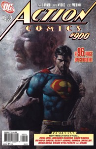
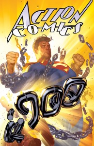
In addition to the standard cover by David Finch (pictured above), this issue of Action Comics also has two variants covers—one by Adam Hughes, and the other by Alex Ross. You only get one, of course, so if you don’t plan on buying the same issue three times over, you’re going to have to decide which one you like best. For the most part, it’s probably a matter of personal opinion.
Out of the three covers, Finch’s is probably the one that has the most to do with the issue’s lead story. It’s dark and gritty, and it features a view of Lex Luthor’s head in the background, complete with glowing eyes. Superman stands in the foreground, shedding his Clark Kent clothes and looking rather intense with glowing, Terminator-like eyes. It feels rather ominous. But I have to say, even though it’s the closest to working as a cover for the main story, it still doesn’t really resemble or describe it at all.

The variant by Alex Ross has quite a realistic style and an interesting perspective. The scene seems to be a road at night, with some bad guys in the foreground holding a gun to a hostage’s head, and Superman behind them, casually tossing a car into the air. Superman is practically a silhouette in the night, lit only by a set of headlights behind him. Something about it makes me think of those old Superman serials, or perhaps the Fleischer Superman cartoons from the 1940s. I can’t really explain what that something is, but even though it’s not my favorite of the three, I do find the imagery striking in its own way.

I’ve been told this cover could be a throwback to the original Action Comics #1 cover. Now that I think about it, the car tossing and the expression on the civilian’s face are pretty familiar…

But my favorite of the covers is the one by Adam Hughes. This one features Superman breaking out of some chains with a simple flex of his muscles, sending the remains flying in all directions. Some of the fragmented links spell out the number “900”, which some would say is a bit gimmicky, but I like it. It goes well with the cartoonish way the letters of the “Action Comics” title are trying to explode off the page and, in my opinion, gives it a fun feel. This is the first issue of Action Comics Superman’s been in for a while, after all, so I think a colorful and dynamic shot of him like this works well.

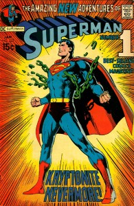
It’s been suggested that this cover could also be a tribute to Neal Adams’ Superman #233 cover.
Action Comics is a series that has often had several stories packed into one issue, and #900 is no exception; this is a 96-page spectacular containing no less than six separate tales, all of which feature or revolve around Superman. And why not? Action Comics is the series that first introduced Superman to the world, and this issue marks his return after an absence of nearly a year.

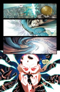
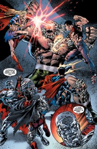
The first story, and the lead story for the issue, is The Black Ring Finale – Reign of Doomsday, which was written by Paul Cornell. As the title suggests, this is the final part of an existing story—one that began all the way back in Action Comics #890! A reader who hasn’t been following the story thus far gets to find out what’s been going on along with Supes himself: Lex Luthor, in a bid for ultimate power, has been hunting down mysterious spatial anomalies known as “Black Spheres”, which appeared throughout space and time after the events of Blackest Night. And as if the thought of Luthor with phenomenal cosmic power wasn’t bad enough…he’s already succeeded. Before he knows any of this, Superman is dragged through a rift to the depths of space where a godlike Lex plans to torment him for a few eternities.
Personally, I’ve always found Lex to be one of the best things about the Superman series. He makes a great bad guy and a great antithesis for Superman because his point of view is always believable. He makes good, realistic points to back up his stance. You may not agree with him in the long run—you may even think he’s deluding himself—but some of his points really do seem fair. Can humanity reach its true potential while an indestructible alien is holding its hand every step of the way? “They need someone to wake them up,” Lex told Superman in the Last Son storyline. “They need someone to show them they can reach the stars without you flying them up there. They need someone human to aspire to.” Whether you agree with him or not, I think that’s some great writing.

When I first read The Black Ring Finale, however, I was a little disappointed. Lex didn’t make any of these points I’ve come to love. Instead, he was completely wrong; he did nothing but claim that Superman couldn’t understand simple human emotions and insisted that only something ridiculously over the top like the deaths of worlds could possibly make him shed a tear. But that isn’t to say this is out of character him—it’s just another side of his character. As intelligent as he is, he’s completely bound by his arrogance. You see it come out whenever Superman actually counters one of his well thought out arguments. But in this story there was no such argument to counter; Lex was just wrong, and when shown so, still managed to twist it into an insult against himself and have a tantrum about it. I hate to say it, but I’ve seen Luthor written much better before, and that’s unfortunate, since not only did this story focus on him and his point of view, but…it was Lex Luthor with god-powers. I just feel that it could have been more than it was. Maybe I was expecting too much?
Superman himself felt like a man who knew what needed to be done in this story. It’s pretty obvious that violence isn’t going to do much against a god, so that was out. That left reasoning with Lex, but he wasn’t really in a mood to be reasoned with, either. So Supes tried to appeal to him—tried to get him to be the hero he apparently knew he could be. Only Superman can have that much faith in someone like Lex.

Pete Woods was the main artist for The Black Ring Finale, and it’s apparently the last time he’ll be drawing Superman for a while. There’s a lot of attention to detail in his work and good uses of colors to set the scenes. There are times, however, where the art of one page feels quite out of place with the rest. This is no doubt a result of there being so many different artists working on the one story—in fact, one page that seemed to stand out to me is signed by Rags Morales, who is indeed listed as another of the artists. But these moments are few and far between; overall, the art is wonderful for this story, which is good, because you just can’t settle for adequate when depicting a towering, glowing, omnipotent Lex Luthor in the middle of space. As an aside, I’m also really fond of the facial expressions in this first segment.
Of course, that’s just one story out of the many contained in this issue. The moment the reader finishes The Black Ring Finale, they’re thrust straight into the next story without warning—quite literally, since the title for this one, Life Support, is at the end rather than the beginning. This short story was written by Damon Lindelof and illustrated by Ryan Sook, and despite only being ten pages long, it packs quite a punch. It’s a simple tale, covering a simple (well, relatively speaking) conversation between two men. Few words are actually exchanged, to be honest, but the writing and art convey the weight of the situation. I’m sure a casual fan like myself can be forgiven for not realizing just who one of the characters was at first, but when I did, I understood the scene perfectly. Surprisingly short, but surprisingly powerful, Life Support was definitely one of my favorites.
The next story is Autobiography, which was written by Paul Dini, pencilled by RB Silva, and inked by Rob Lean. This one’s even shorter than the last, being only three pages long. It’s simply a cosmic space-hippo named Sarva—whom I’ll admit, I don’t remember at all if he’s an existing DC character—telling a younger looking Kal-El a story. I quite liked this one, too. Sarva’s story describes a moral dilemma that he was once faced with: was it better to save a species, knowing they’d have to go through the suffering and misery of starting life over in a terrifying new place, or was it better to simply let them die a peaceful death? This kind of dilemma certainly isn’t a new one in fiction, but science-fantasy often allows them to be presented in ways that would only be hypothetical in real life. After all, how often would any of us ever be faced with such a massive decision? The artwork here is bright and detailed once again, and I really liked Sarva’s design.
Following Autobiography is Friday Night in the 21st Century, written by Geoff Johns and drawn by Gary Frank. This one’s only four pages, and two of those are just a two-page spread. I’d barely even call it a story, really…more of a fun extra, showing us Superman and some of his friends getting together for some down time. It’s something you don’t see often, and it’s pretty funny seeing a bunch of heroes in full costume hanging out in some apartment.
The final comic in the issue is called The Incident. Written by David S. Goyer and drawn by Miquel Sepulveda, this is another simple narrative that is essentially just one conversation between Superman and a man from the government. We discover through the dialogue that Superman chose to participate in a non-violent protest in Iran. Sounds simple—uh, by DC standards, at least—but tossing Superman into politics is like showing up at a peace talk in a tank. Supes’ actions lead to some surprising consequences by the end of this short tale, which might have some lasting effects. In the end, politics aside, this seemed like a feel good story with a happy conclusion to me. Then again, as I’ve said before, politics always seem to go over my head, and I’ve already heard of this event causing some controversy amongst the fans. The art is just as wonderfully detailed here as it is in the rest of the issue; maybe it’s because it’s a milestone, but it seems like everyone involved with the art was working really hard for this issue.
So that’s it for—oh, wait, there are still over fifteen pages left. That’s right, issue #900 has a couple of extras for you to enjoy. One is simply another two-page-spread, this one by Brian Stalfreeze (which is a pretty cool name, I just want to point out), depicting Superman’s evolution over the decades. I’m sure there are Superman fans who wouldn’t mind having a blown-up version of this on their wall. The other extra is rather unusual, but at the same time, it might just be my favorite thing from the whole issue: it’s a screenplay.
Titled Only Human and written by Richard Donner (director of the old Superman movie!) and Derek Hoffman, this short screenplay tells the story of an encounter between Superman and Cliff Carter, a charming former running back and center fielder. Having left his life as an athlete behind and become the spokesman for a company called SuperTech, Carter is interviewed by Lois Lane and tries to convince all those around him what a good idea it would be for everyone to have supersuits capable of turning anyone into a superhero. If you’ve read the rest of this review up to this point, you might be able to guess why I like this guy so much: a lot like Luthor, he makes some damn convincing points in his argument. There’s some great writing here—really enjoyable stuff. I may not even have read it if I hadn’t been asked to review the issue, and that would have been a real shame. Matt Camp provides some simple sketches of the scenes, so this is almost like a little storyboard as well as a script.

After 96 pages, the issue finally comes to a close with a message from the editors, Matt Idelson and Wil Moss, as well as a couple of letters from the fans that they picked out. They’re obviously proud of how #900 came out, and I honestly can’t blame them. There’s a ton of content, some good writing, and some really polished art. Every last element of the issue involves Superman in some way, shape, or form, so it really does seem like a great welcome back to the character. But as a milestone issue, how was it as an introduction for new readers?
Well, I’m not sure I’d recommend it for that purpose. Normally anniversary issues are a good place to jump in because they serve as an introduction to the characters and kick off a brand new storyline. Now, the lead story in #900 does start a new storyline, but it feels more like you’re jumping into the middle of something than really starting at a beginning. It’s not only the start of a new story—it’s the end of one that’s been running for almost a year. And even if you’ve read the past ten issues of Action Comics (which I have at this point), you still might not know how some of the characters came to be in the situations they’re in, since those events are explained in about five different ongoing DC titles. It’s a good story, don’t get me wrong, but as someone who’s been out of the loop for a while, I’m left with many questions. If I had to recommend a place for someone to start reading Superman, I’d have to suggest something more like Up, Up and Away—though I have to admit, comparing this one story in this one issue to a multi-issue arc set a year after anything that happened before it probably isn’t fair of me.

I really hope it doesn’t seem like I’m coming down too hard on this issue. It isn’t the greatest place for new readers to begin, but I’m sure it isn’t the worst, either. And to be fair, not being a good place for new readers to jump in definitely doesn’t make it a bad comic. If you ask me, this issue feels more like it’s celebrating Big Blue’s return than anything else, and with multiple Superman-centric stories packed into one issue, it does that very well. In the end, this one might be more for the fans who’ve been patiently awaiting his return than for new fans, and there’s certainly nothing wrong with that.
Cover: B+ (You get a choice of three, and I like them all in different ways—even the one I’ve seen described as “boring”!)
Writing: A- (Some weird parts, but also some really well written parts. The good parts more than make up for any of the not-so-good.)
Art: A (It feels like they really went all out. The level of detail is impressive.)
Overall (not an average): A- (Not a great place for new readers to jump in, but technically speaking, there’s no written law saying it had to be. A good, well-packed issue for a reasonable price that I’m sure almost any Superman fan would enjoy.)
This comic was purchased at retail.
Superman – © 2011 DC Comics. All Rights Reserved.


